Optimize a Revenue-Critical Booking System & E-commerce Experience
My Role
UX/UI/Web Designer
Duration
6 months
Tools
Figma, WordPress Elementor, VWO, Google Analytics, Typeform
At Wellnest
Wellnest is a Germany-based startup offering private spa experiences in fully private “nests” equipped with a whirlpool, sauna, and shower. Guests can enhance their booking with optional add-ons such as vibe packages (decorations, food, and drinks) as well as textiles and vouchers.
My focus was on optimizing and maintaining Wellnest’s booking system and shop experience, both of which were core revenue drivers and key first touchpoint for customers.
🎯The Core Problem
As the product scaled, the booking and shop flows became increasingly complex:
UX Problems
Customers struggled to understand availability logic (duration vs. date).
Add-ons like vibe packages, textiles, vouchers, and gift boxes were confusing and hard to compare.
Too many options presented at once led to hesitation, drop-offs, and missed upsell opportunities.
Business Goals
Increase conversion rate
Increase Average Order Value (AOV)
Reduce decision friction without reducing choice
🚦Booking system - Make availability understandable
Challenges & Frustration:
Customers struggled to find an available date or duration.
‘Ok, I see a 3-hour slot available, but why can’t I book for 2 hours?‘
Goals:
Increase conversion rate and AOV (Average Order Value).
Maximize nest bookings.
‘Sorry, we don’t have a 2-hour slot on this day, but we do have 3 hours available!’
Initial Solution: Traffic Light System
We introduced a traffic light system to explain availability:
Green: Available
Yellow: No exact match, but similar options are available (e.g., no 3-hour slots, but 4- or 5-hour slots are open)
Red: All sold out
However, A/B testing via VWO showed no improvement in conversion and AOV.
Design Decision & Redesign
Instead of explaining the system with legends and labels, I chose to reduce cognitive load visually:
Removed the traffic light legend entirely
Introduced a filled vs. unfilled visual language to indicate availability
Let the interface show availability instead of explaining it
Available
The desired duration is not avaiable, but these durations are still free
Impact
+20% increase in AOV and conversion rate
Fewer booking-related questions, less hesitation and dead clicks during booking
👉 Key learning: At high-intent moments, clarity beats explanation.
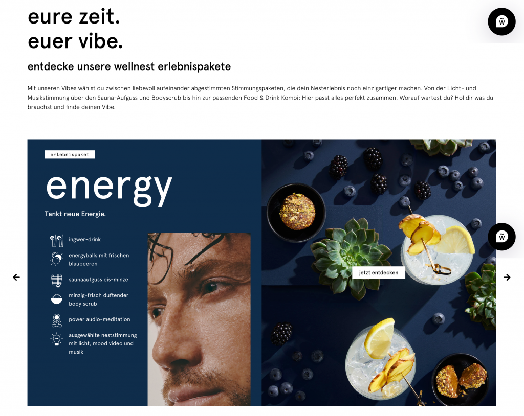
🌹Vibe Packages - Turning confusion into upsell
Challenges & Frustration:
What is a vibe package?
What do I actually get?
‘What is the difference between vibes and textiles? And can I book them both?’
Goals:
Increase conversion rate and AOV
Clearly communicate the value of vibe packages and textiles.
Design Decision
My goal was to make the value of each add-on immediately visible, without additional click.
Displayed all included features upfront
Separated vibe packages and textiles into distinct sections
To further reduce decision fatigue, I designed and developed a Vibe Finder using Typeform:
Users answered a short set of preference-based questions
Logic-based recommendations suggested the best vibe and product
Users could proceed directly to checkout
👉 This worked like a personal shopping assistant, especially effective for gift buyers or first-time customers.
💻Website UX/UI Maintenance & Consistency
Beyond feature work, I was responsible for maintaining a cohesive, scalable design system across the website.
Key improvements:
Standardizing spacing, margins, and padding
Updating icons, buttons, and color usage to the latest brand styles
Prioritizing mobile-first design, informed by analytics showing over 70% mobile usage
Menu & Footer
I also designed the footer to balance aesthetic simplicity with functional clarity, allowing users to quickly find key information while reinforcing Wellnest’s relaxing, premium identity.
The headline ‘relax mode on’ reflects the brand’s promise while guiding users to essential information such as vouchers, FAQs, opening hours and contact details.
Vibe explanation
To showcase the 5 vibe packages without taking up too much space, I kept the carousel UI element for easy navigation. I combined brand imagery (people enjoying the experience) with product visuals (food and drinks) to communicate both the feeling and the tangible benefits of each vibe package.