
UX/UI Designer
Lorem ipsum dolor sit amet, consectetur adipiscing elit. Ut elit tellus, luctus nec ullamcorper mattis, pulvinar dapibus leo.
This is the heading
Lorem ipsum dolor sit amet, consectetur adipiscing elit. Ut elit tellus, luctus nec ullamcorper mattis, pulvinar dapibus leo.
This is the heading
Lorem ipsum dolor sit amet, consectetur adipiscing elit. Ut elit tellus, luctus nec ullamcorper mattis, pulvinar dapibus leo.
Description
Lorem ipsum dolor sit amet, consectetur adipiscing elit. Ut elit tellus, luctus nec ullamcorper mattis, pulvinar dapibus leo.
🧩Problem
Goodreads is the world’s largest social cataloging platform for book lovers acquired by Amazon in 2017.
It is the most commonly used and the go-to platform for book lovers to track their reading progress, discover new books, and connect with fellow readers. Yet, with all the resources from Amazon, the app seems to be frozen and forgotten. Its out-dated interface, flat user flows, and lack of insights often leave users disappointed rather than inspired.
As a Product Designer and bookworm at the same time, I can’t help but reach my hand to this app I use almost everyday.
💪🏻My Role
I led this redesign project independently, from the ground up. Starting with user research, I spoke with readers to understand their frustrations and needs with the current Goodreads app. Thanks to the very wide user pool, there are also lots of videos from book-enthusiastics to talk about Goodreads and if they love or hate it.
With limited time, I decided to focus on those most frequently mentioned pain points that were consistently holding users back from enjoying the experience.
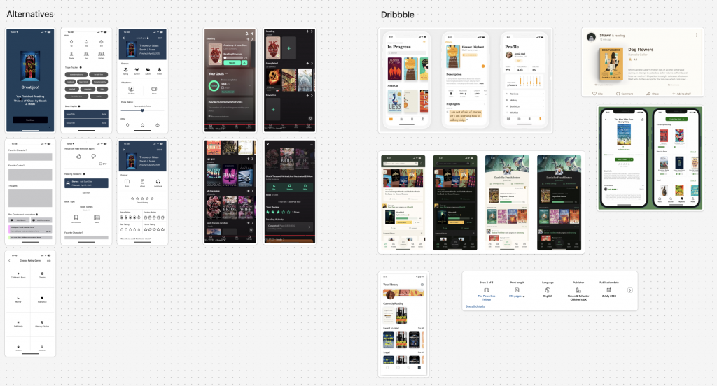
In parallel, I conducted market research to see how other reading and content-tracking apps approach similar challenges. This helped me gather fresh inspiration and ensure my design direction felt modern, intuitive, and aligned with today’s design standards.
This project was not just about improving the look of the app—it was about reimagining the experience through the lens of real users, current design trends, and thoughtful prioritization.
🧠 User Research & Discovery
User research:
- Conducted user interviews with 3 readers who are active users of Goodreads
- Watched 10+ book-tok videos talking about the pros and cons of Goodreads
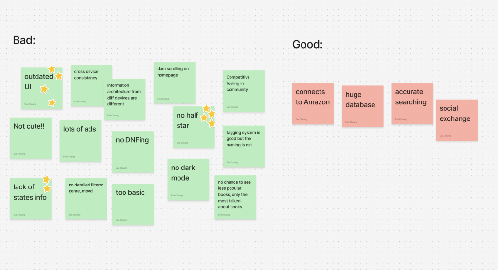
- Used Miro to organize the bad and good
- Competitive analysis of competitors like The Story Graph, Literal, Fabel, and TBR
- Research on case study from other designers on Dribbble and Behance
🔍 Key Insights
“The app hasn’t changed a bit since the day I downloaded it.”
→ Users consistently described Goodreads’ interface as outdated. The visual clutter and rigid layout made it hard to focus on what mattered—discovering books, logging progress, and engaging with their reading journey in an enjoyable way.
“I want to understand how I read, not just what I read.”
→ Readers expressed a strong desire for more meaningful insights into their reading habits—such as genres they gravitate toward, monthly trends, and emotional patterns across books. Goodreads’ current stats feel surface-level and uninspiring, especially during end-of-year wrap-ups.
“What about a .5 star?”
→ Readers have been CRYING out for a more flexible rating system, especially the ability to give half-star or even quarter-star. Also a review system where users could review the book based on different genre—such as humor level, tears level, and spicy level, which would make the review not only more in-depth but helpful and relatable for those with similar preferences.