Create a platform for users to easily order foods with accurate delivery time
A picture-based description page of each dish
Clear categories of food choices
Provide a extra gorcery shopping service
Our goal
Creating an app for customers of Ichiban to order dishes, track delivery easily, and benefit from the grocery feature.
Meet our users
Profile
Age: 25
Location: Bonn, Germany
Occupation: Master student & Student assistant
Goal
An master’s student who is busy with his thesis
Wanting to find a good hometown restaurant
Frustration
Not accurate estimated time of delivery
Can’t read menus in German
Profile
Age: 32
Location: London, UK
Occupation: Sr. Manager of Marketing Strategy
Goal
Taking good care of her son after work, while sometimes she’s too tired to cook
Someone to buy groceries so that she could have some “me time”
Frustration
Pre-order system and contact of delivery staff are not always provided
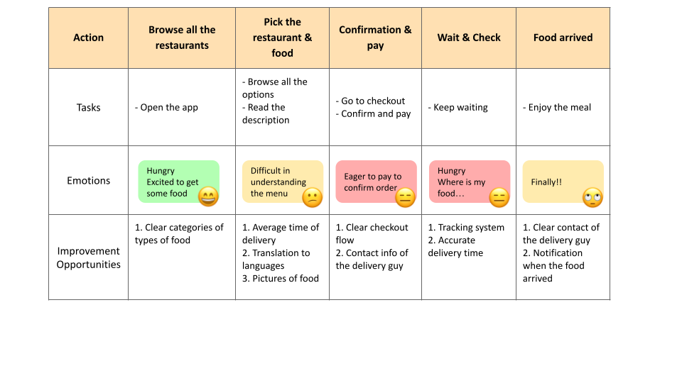
User Journey Map of Lee
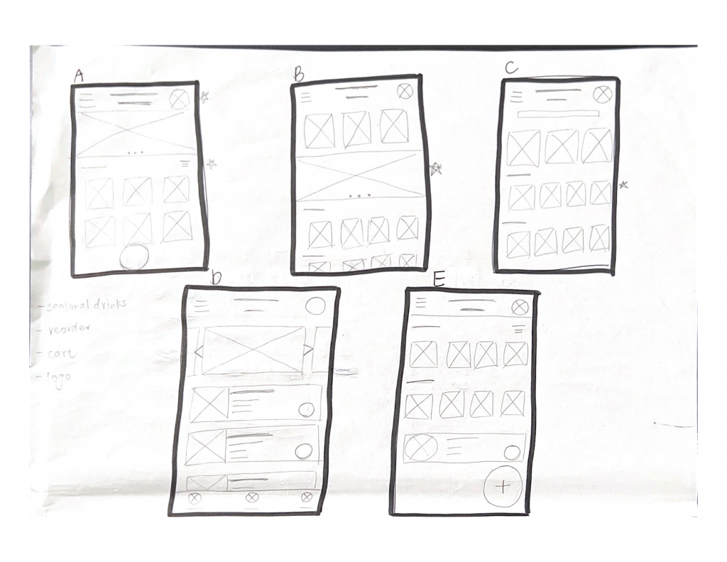
Paper Wireframe
I took some time to draft an iteration of how the main page would look on paper.
By comparing each design, I highlighted some preferred elements with stars that are commonly created in my drafts. For example, a top navigation bar, grids, and a horizontal scrolling menu.
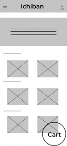
From Paper to Digital
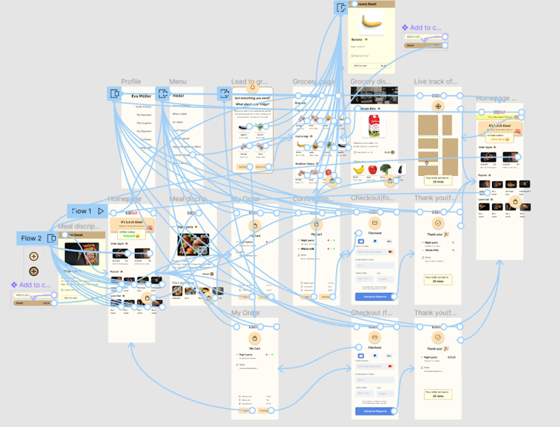
In the initial phase of design, I first brought my design to Figma and made sure all basic and vital elements are added.
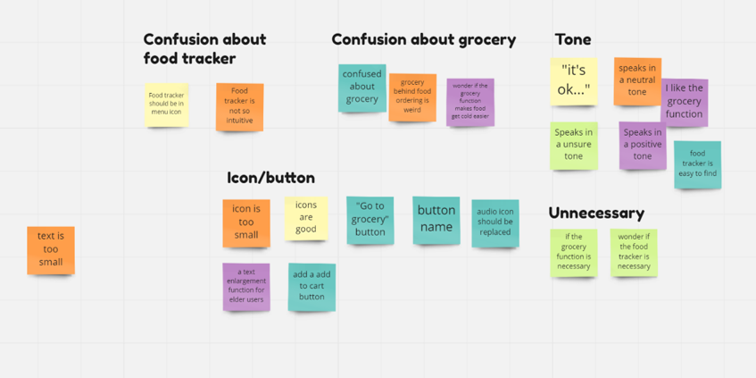
After the main user flow was created, I recruited 5 potential users to conduct the usability study and collected feedback.
Usability Study
I conducted two rounds of usability studies. Findings from the first round helped guide the design from wireframes to mockups. The second usability study used a hi-fi prototype and revealed what aspects of the design needed refining.
Round 1 findings
Users were confused about the food tracker position
Most users did not understand the grocery feature
Reflected in a “so-so” attitude
Round 2 findings
Images of groceries should directly lead people to the item detail
“Now we need” circle made confusion with the food tracker
Consistency of the app needs improvement
Before & After
Iteration #1
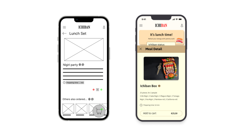
Before the usability study, the main goal of the meal description page was to make every dish photo and description clear.
However, based on user feedback, I adjusted the page to a pop-up page so that users can easily continue shopping.
Iteration #2
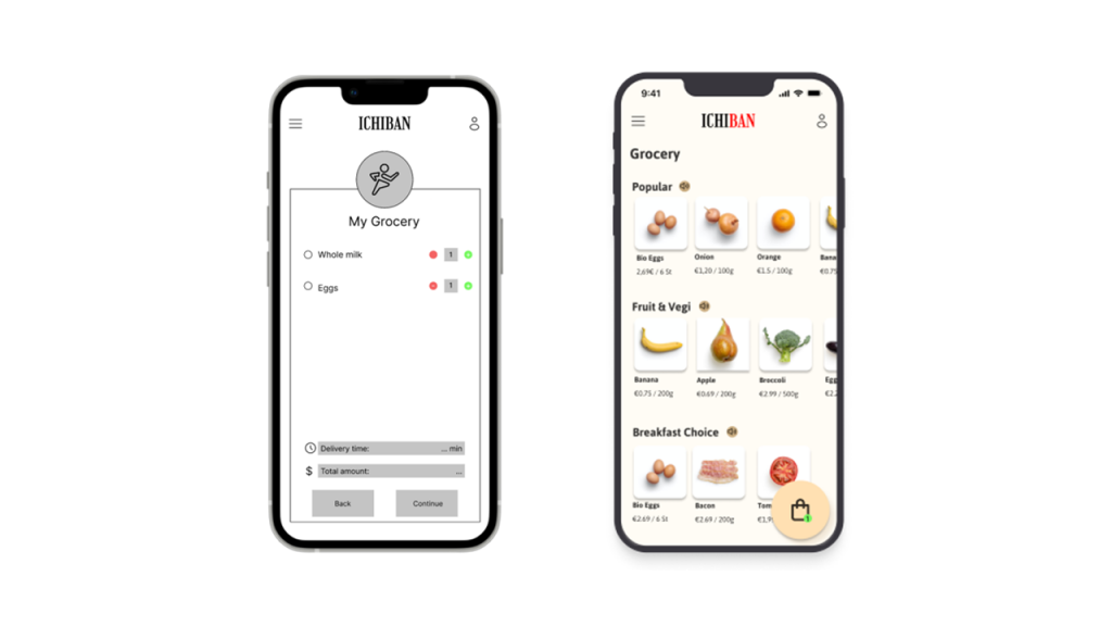
I designed the grocery page as a reference page where users type in the items they need before the usability study.
During the study, most users found it confusing. Therefore, I re-designed it to a more user-friendly and visually appealing page.
Prototype
The hi-fi prototype consists of more interactive elements and animation between pages.
It also iterated feedback from the previous usability studies.
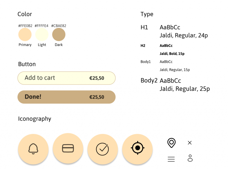
Sticker Sheet
Warm colors and rounded shapes convey comfortable feelings to users of Ichiban’s app. We wish our users could feel relaxed and less anxious while using the app and prepare themselves for a nice meal. Color of yellow, light yellow, and cream brown gives a natural and calming feeling, which is used throughout the app.
The main typeface of choice is Jaldi. We choose a sans-serif typeface with rounded edges, in order to keep the consistency of comfortable and relaxing vibes in the app.
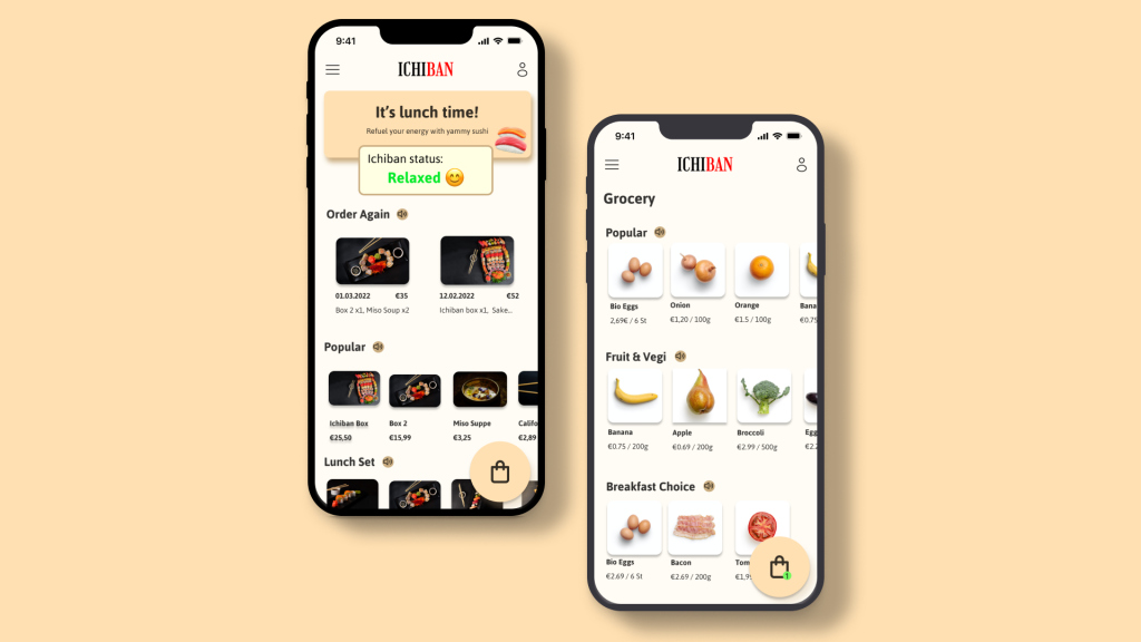
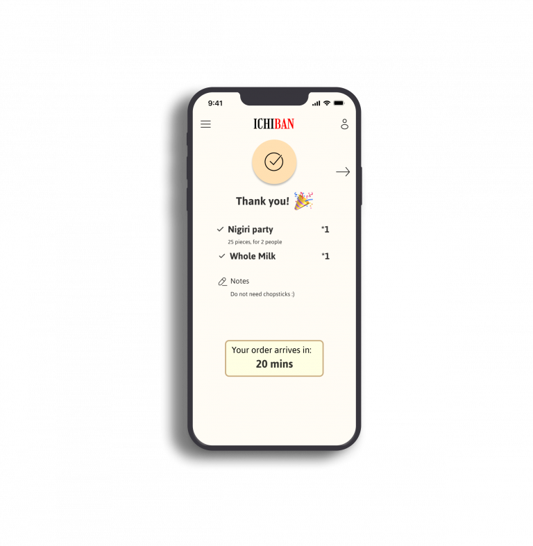
High-Fidelity Prototype
Takeaway
"It's clear and easy to use!" "I could imagine myself using app like this"
What I learned:
During the designing process, I understand the job of a UX designer is to make the users’ needs into something real. Therefore, it is crucial to put users at the front while designing at all times. Usability studies and feedback are great opportunities for designers to reflect if they understand users’ needs and time to make improvements.
What's Next
Conduct the 3rd round of usability study with users from different age groups. In order to understand the needs and pain points of users of different ages.
Conduct competitive analysis to understand the trendy features to make Ichiban’s app more competitive.
Browse Dribbble or Medium to know the trendy visual design of apps nowadays to make Ichiban’s app more visually appealing.